![[Design: Key Rules for Website Colors] Primary, Secondary & Accent at Work](https://www.lugo.tw/assets/uploads/articles/1758879005_3/1759379828_6cba086fa7451fecee04.jpg)
In website design, color is more than decoration—it expresses mood, style, and brand identity. When users first land on a page, what they perceive instantly is often the atmosphere created by color: bright and warm tones convey friendliness, while darker, more subdued colors build a sense of professionalism. Color communicates a website’s “personality,” guides attention, shapes content hierarchy, and even influences emotions and decision-making.
For most people, website color schemes may seem complicated, but understanding three key roles—primary, secondary, and accent colors—is enough to grasp the logic behind page design. The primary color sets the visual tone, the secondary color enhances structure and depth, and the accent color draws attention. Learning these roles is like learning the website’s “color language”: even non-designers can quickly identify focus points and visual hierarchy.
Primary Color
The primary color is the core of the page, defining the tone and style of the entire website. Even if it doesn’t dominate the page in sheer volume, its presence in key positions—such as banners, headings, or CTA buttons—instantly builds brand recognition and visual focus.
When selecting a primary color, both brand positioning and emotional expression should be considered: stable hues communicate professionalism, bright hues convey energy, and soft hues create approachability. The primary color guides users’ eyes naturally to essential elements, making the layout’s direction clear.
Secondary Color
The secondary color helps distinguish different areas of content and enhances readability. It often appears in subheadings, card backgrounds, secondary buttons, or functional sections, helping users understand the structure of a page.
Secondary colors bring clarity to layouts, keeping modules distinct and organized. When paired with the primary color, they avoid competing for attention while adding visual interest and balance.
Accent Color
Accent colors may appear sparingly, but they are powerful attention-grabbers. They highlight CTA buttons, labels, alerts, or other key markers. If a design doesn’t include a distinct accent color, the primary color itself can take on this role.
Their usage, however, must be restrained: too much and they overshadow the primary color; too little and they fail to guide the eye effectively. With thoughtful placement, accent colors ensure users quickly capture key information.
Website Color Scheme Examples
Below are homepage screenshots demonstrating the use of primary, secondary, and accent colors:
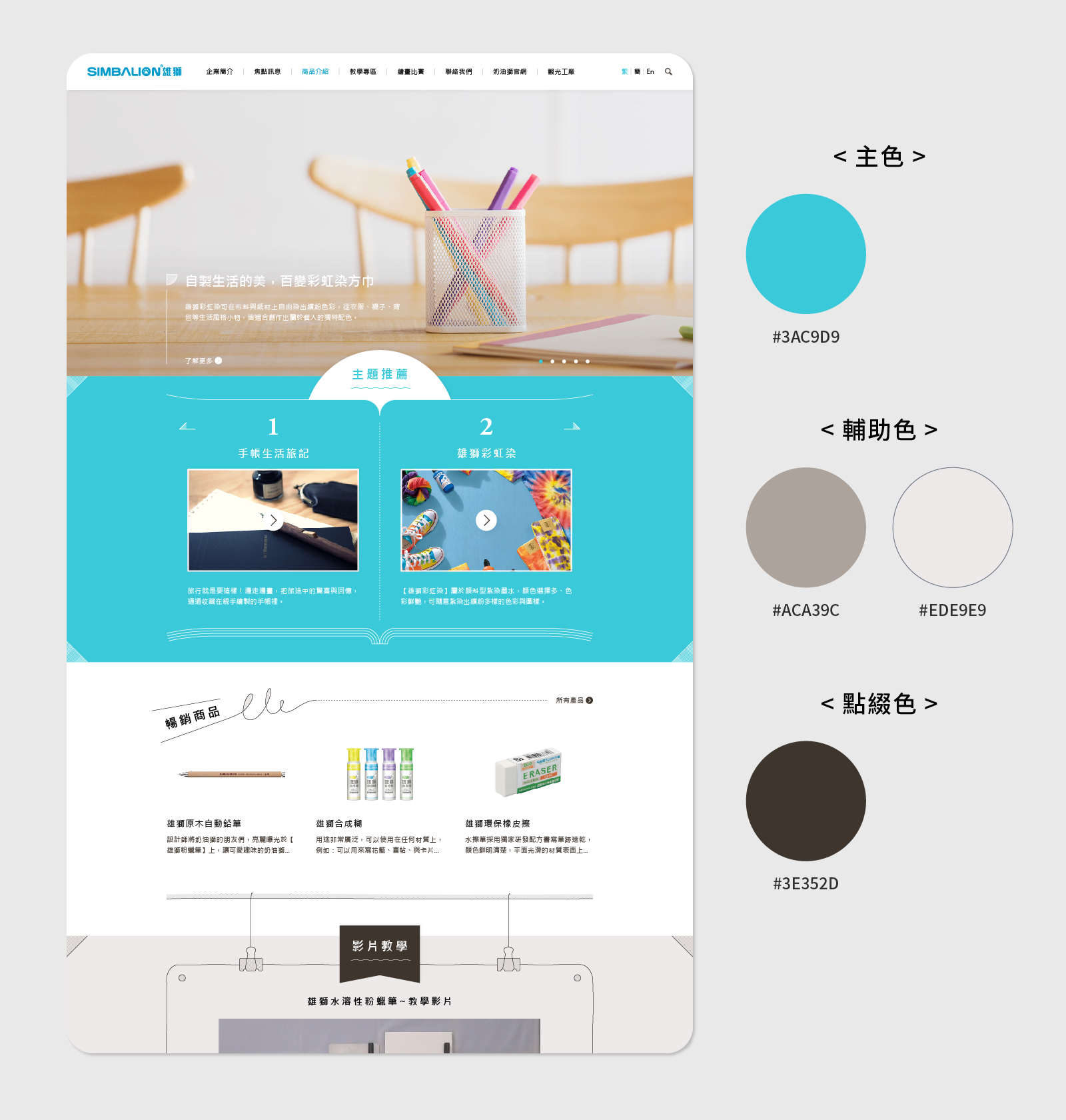
“Light Color Scheme: Creating Layers and White Space”
Light tones are not just pale colors—they help establish depth within a layout. By applying blocks of varying brightness to section backgrounds, subheadings, or buttons, users can easily distinguish content areas without feeling overwhelmed. White space is also a crucial part of light color design, offering breathing room that guides the eyes naturally toward content and enhances reading comfort.
“Light Color Scheme: Harmonious Application”
The strength of a light palette lies in its overall harmony. By keeping tones consistent across text, buttons, and backgrounds, the page maintains a cohesive look. Whether within a single module or across the entire homepage, the design avoids jarring contrasts. This unified use of light colors creates a soft, welcoming atmosphere and helps users focus on content, improving browsing flow.
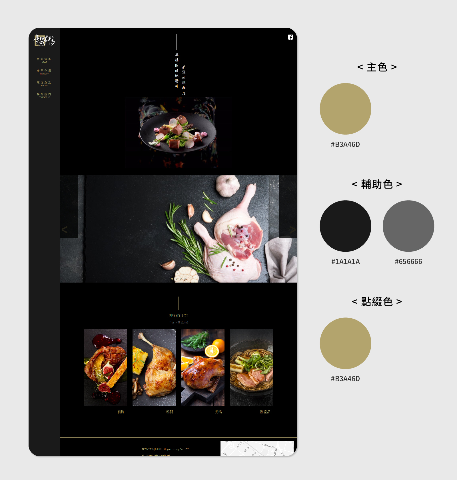
“Dark Color Scheme: Building a Steady Atmosphere”
Dark palettes create a composed and focused visual experience. With well-balanced combinations of primary, secondary, and accent colors, elements remain clear and distinct even against darker backgrounds. Careful use of text and spacing ensures readability and structure, while the overall mood conveys professionalism and sophistication, naturally drawing attention to key content.
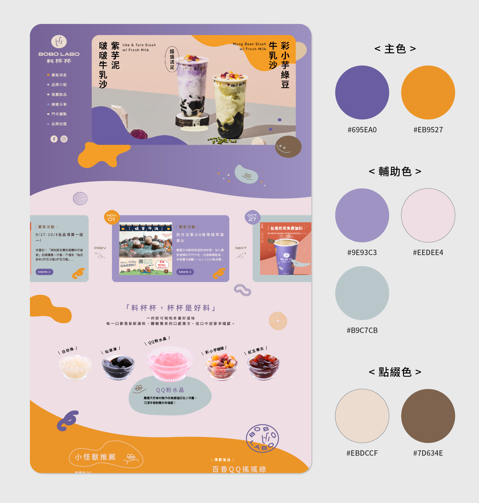
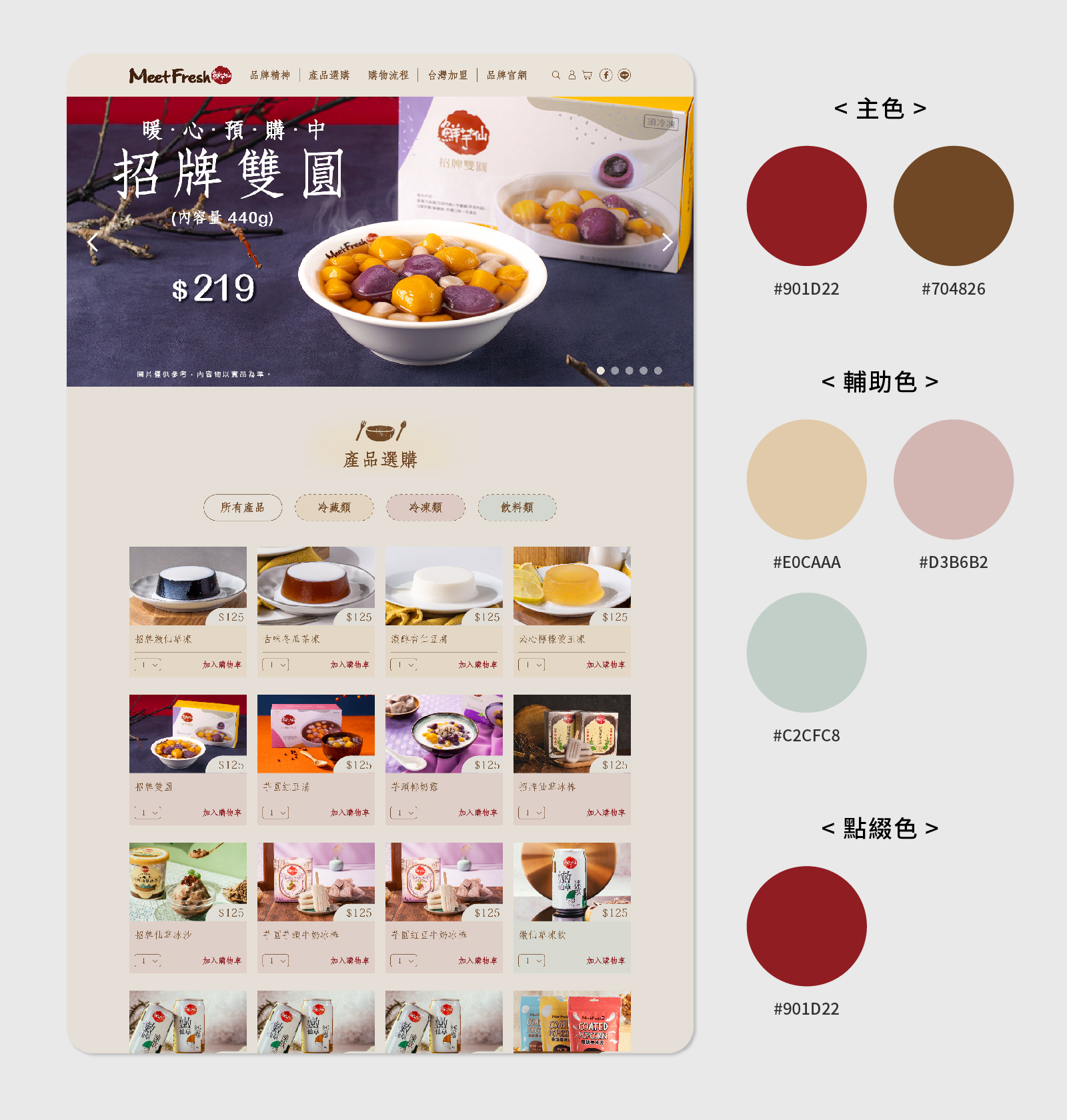
“Complex Color Scheme: The Effect of Multi-Element Balance”
When a page includes many different elements, color interplay is essential. Through careful coordination of primary, secondary, and accent colors, each element maintains its individuality while coexisting harmoniously. This balance prevents clutter, keeps focus points clear, and results in a vibrant yet orderly visual experience.
Subtle but Essential: The Role of Neutral Colors
Beyond primary, secondary, and accent colors, neutral colors play a vital role in web design. Common neutrals—black, white, gray, and their variations—are typically used in text, backgrounds, white space, or fine dividing lines. Though understated, they are crucial for maintaining balance across the layout.
Neutrals enhance readability, reduce visual fatigue, and allow key colors to stand out. White space combined with neutrals adds breathing room, making content more approachable and layouts more structured. Furthermore, neutrals can influence mood: light grays create a soft and relaxed feeling, while darker shades or black convey stability and professionalism. Like a behind-the-scenes mediator, they maintain rhythm, add depth, and highlight essential information. Used wisely, neutrals elevate the overall design quality, ensuring the site is both visually appealing and user-friendly.

“In this example, the arrangement of text, white space, and dividing lines demonstrates how neutral colors contribute to balance and clarity in a layout.”
Conclusion
By understanding the roles of primary, secondary, accent, and neutral colors, you can truly read the “color language” of a website. The annotated screenshots provide a clear way to observe how colors function across text, buttons, backgrounds, and white space. Even without design expertise, readers can recognize how colors guide attention, build hierarchy, and shape brand identity.
When viewed separately, neutral colors further highlight the balance between text, backgrounds, spacing, and dividers—showing how they complete the overall design. Learning how these colors work together explains why certain elements catch the eye, others provide visual rest, and how a website achieves readability, harmony, and emphasis of important information—all of which enrich the user’s browsing experience.