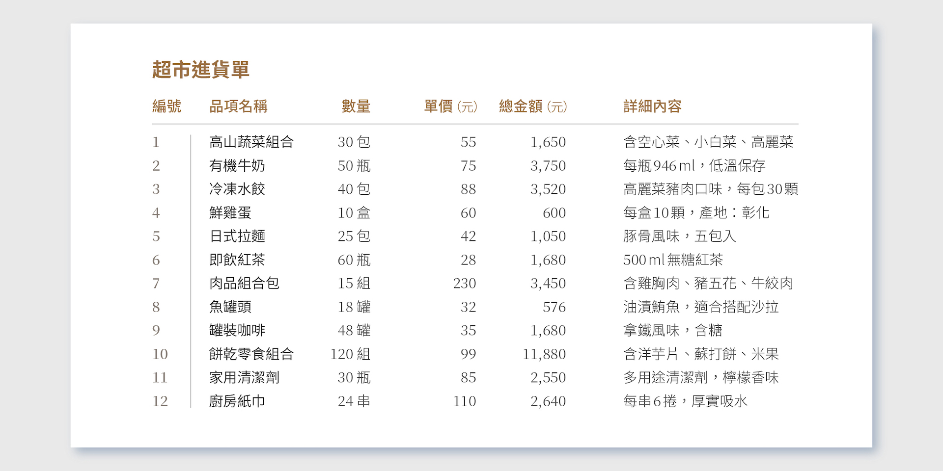
The quality of a design piece is often judged at first glance, and “layout” plays a critical role. No matter how great the content is, if the layout is messy and hard to read, viewers will lose interest. Non-designers often wonder, “I’ve included all the necessary information—why does it still look ugly?” The issue isn’t the content but the arrangement and visual logic. Layout isn’t just about “placing elements,” but about organizing information so it’s orderly and easy to absorb. In this article, we’ll use a “grocery order sheet” as an example to show you how text content evolves through the layout process.
Next, we’ll apply fundamental visual principles—such as alignment, white space, typography hierarchy, and visual hierarchy—to demonstrate step by step how a layout becomes clear, readable, and organized. This process not only makes the design prettier but also ensures that the information is effectively understood and communicated.
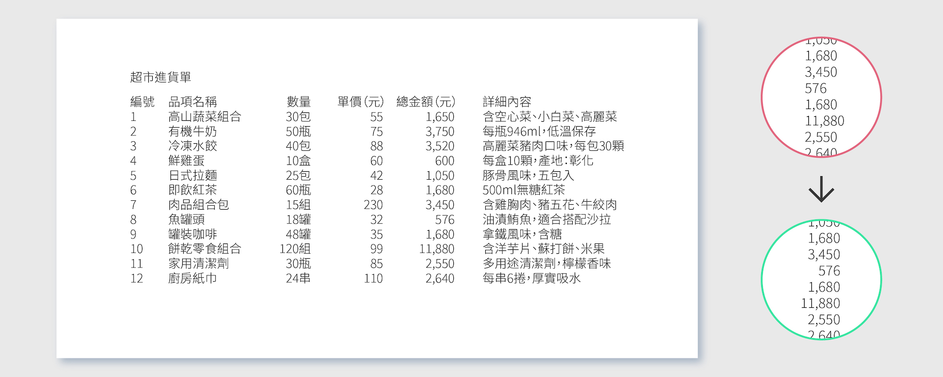
Alignment creates a neat and orderly visual structure. When text and images are placed randomly, the design appears chaotic. By using left, right, or center alignment, you guide the viewer’s eye naturally, making content easier to read and comprehend. Consistent alignment gives the entire piece a more systematic and professional look.
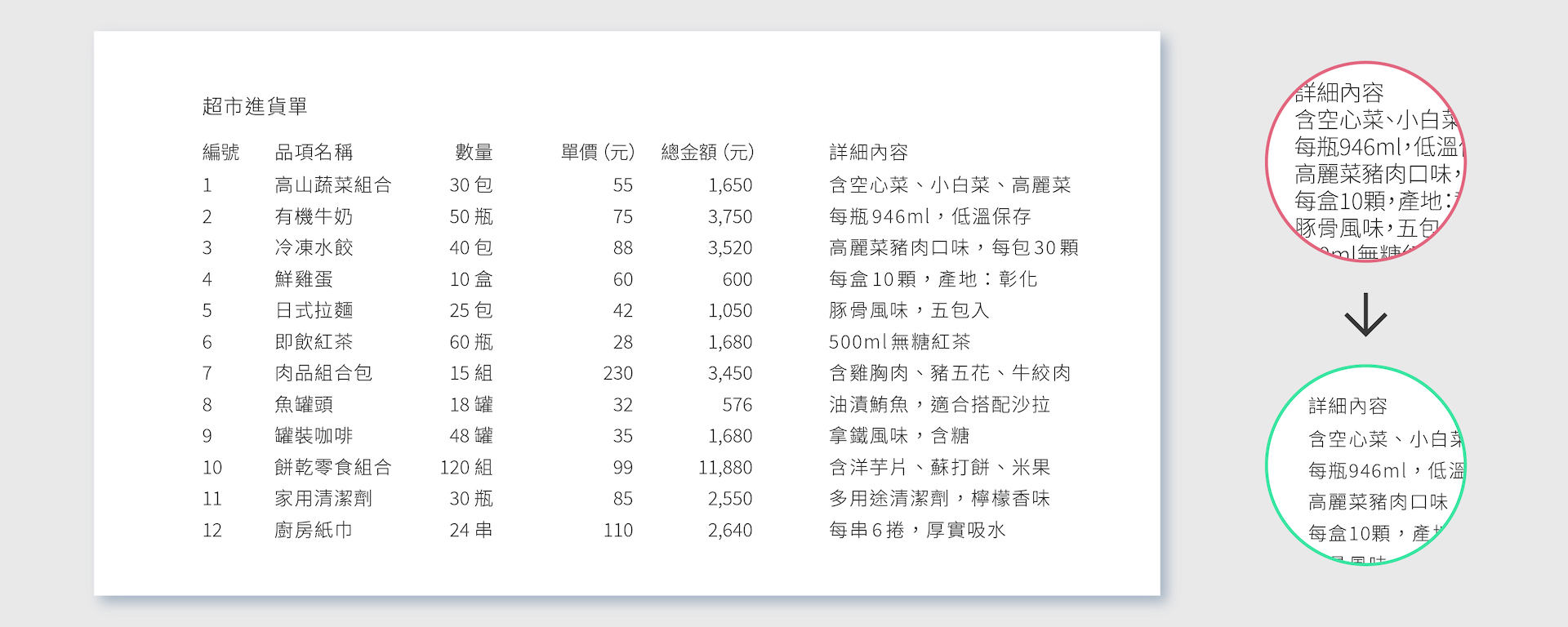
White space isn’t just “empty space”; it’s an effective layout technique. Proper white space prevents clutter, makes the design more comfortable to view, and highlights key elements. Beginners often feel compelled to fill every gap, which creates visual pressure. In reality, white space enhances the separation of information zones, making content clearer and easier to read while giving the design breathing room.
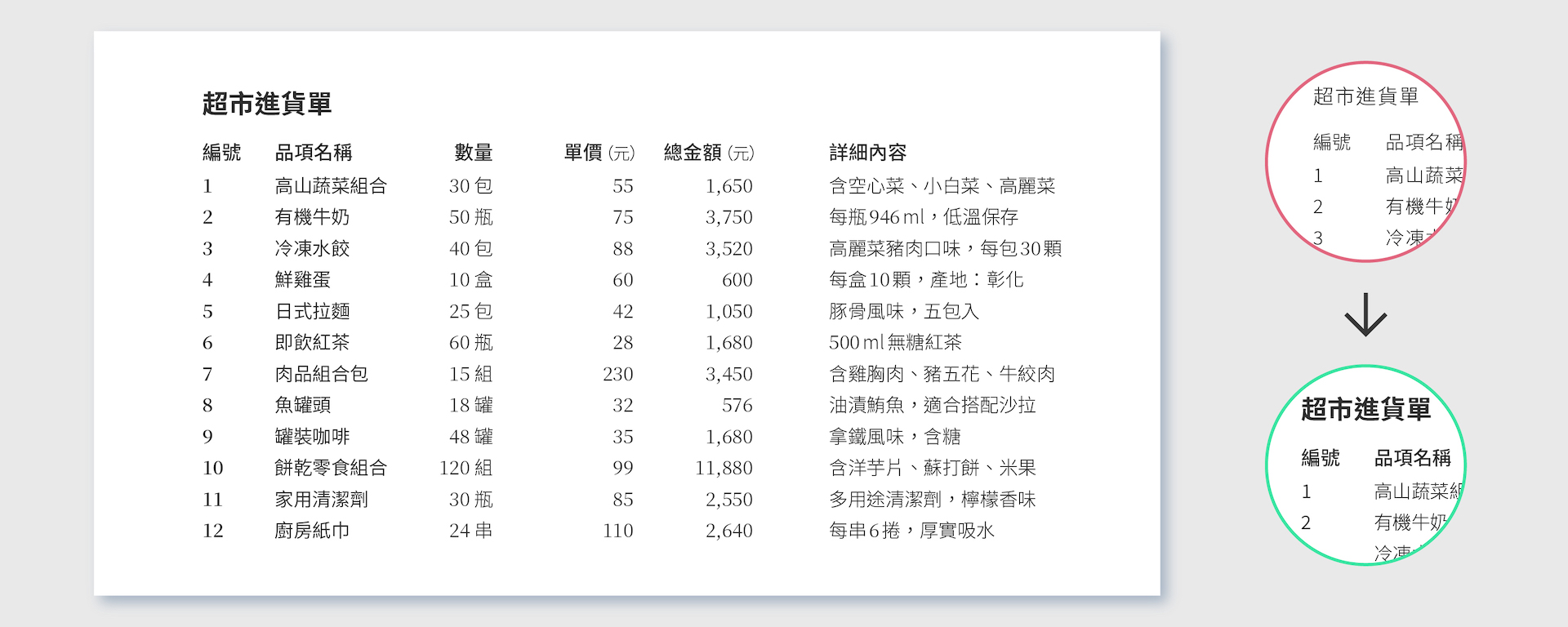
Typography is not just decoration; it carries emotion and hierarchy. Choosing appropriate font families, sizes, and weights helps readers distinguish between headings, body text, and annotations. Overusing different fonts clutters the design. Conversely, maintaining consistency while emphasizing key text enhances both information delivery and aesthetic appeal.
Visual hierarchy helps viewers identify the main points at first glance. By varying font size, color contrast, position, and spacing, designers guide the reading order. A well-designed hierarchy leads the eye naturally from the main heading to the detailed content, improving information absorption and giving the layout a clear rhythm and structure.
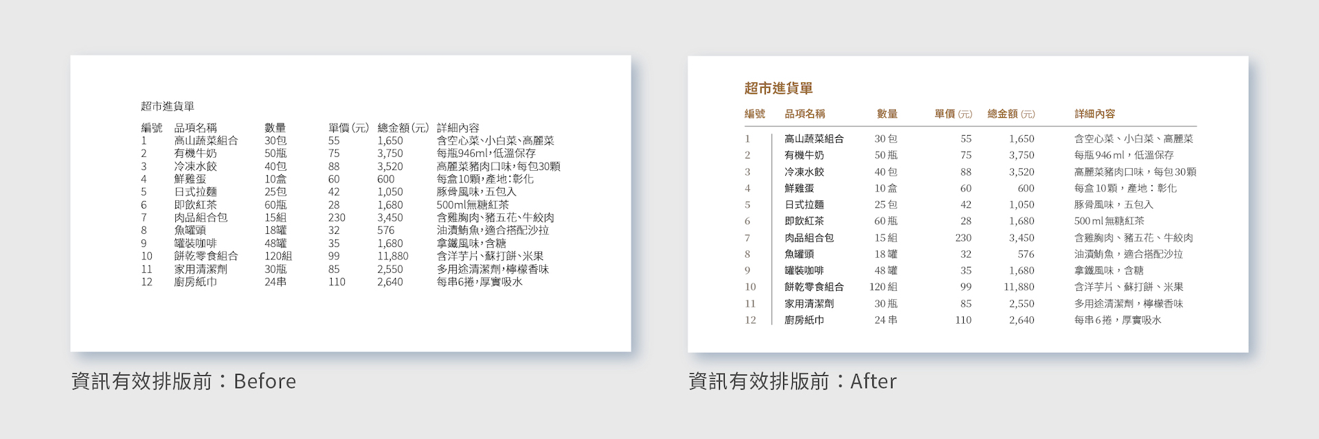
The same content without design often results in cramped text, unbalanced image proportions, and misaligned elements, making the page look chaotic and unfocused. After layout optimization, this “grocery order sheet” has text and images arranged in order, with appropriate white space and hierarchy. The result is not only clearer emphasis but also a more polished overall look. Good layout isn’t just about aesthetics; it’s about ensuring information is understood clearly and conveyed effectively.
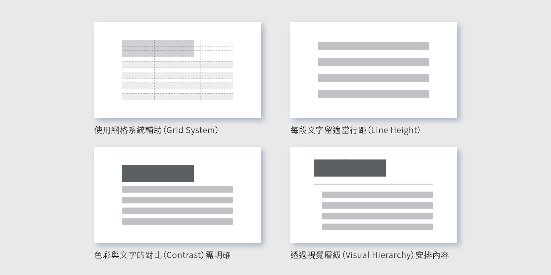
Mastering layout design isn’t difficult; it hinges on a few basic principles. First, establish a grid system. This means dividing the canvas into fixed columns and margins, giving text and images alignment guides so the design stays organized. Next, adjust line spacing—many people cram text together, which is uncomfortable to read; simply increasing line spacing makes paragraphs instantly more readable.
Contrast between text and background is also crucial. If text is too light or the background too busy, it becomes hard to read. Adequate contrast reduces eye strain and encourages readers to keep reading. Finally, create content hierarchy: make headings large, bold key points, but don’t make everything stand out. A balanced hierarchy of emphasis and de-emphasis guides the reader smoothly. With these layout habits, whether it’s a report, presentation, or social media graphic, your design will look more professional and capture attention.
Many beginners think “the more elements, the better,” so they add images, text, and effects until the design is chaotic. In truth, design is not about accumulation but about choices: choosing what to include and what to omit; choosing which elements to emphasize; choosing which fonts and colors to use. Layout is the process of realizing these choices. When you learn to remove unnecessary decorations, organize information logically, and respect the power of white space and alignment, your design naturally becomes more refined and coherent. Beauty in design comes from moderation, not filling every gap; good layout is the bridge that makes design both visible and understandable. Once you master these basics, design is no longer a talent but a language anyone can learn.
